2003 · The problem
Sixteen agencies. Three products. Zero consistency.
Chris was brought on as the first Senior Product Designer at Citrix, joining a handful of human-factors engineers to form a UI design team. Every screen across Installation Manager, MetaFrame XP, and Password Manager was outsourced to one of sixteen different marketing agencies — with no style guide, no rules, no shared vocabulary. Software was 4-bit color and pixelated unpredictably across systems.
The first move was a screen-by-screen, folder-by-folder audit of all three products, sitting with SMEs to learn each feature's intricacies — knowing Citrix's long-term plan was a unified suite, and that Microsoft was absorbing more of the territory into the base Server SKU every year.
The four-year ride · NT → Vista
A timeline of consolidation.
2003
Audit & alignment
Audited three products end-to-end. Sat with engineers. Established the first product design function inside Citrix and started hiring one designer per year.
2004
A unified — if simple — brand
Got everyone "sold" on consistency through small steps. Marketing still owned the brand and red still ruled — emotionally wrong for tools that fix problems in your server farms, but it was a starting line.
2005
Seven acquisitions, one suite promise
Citrix bought seven companies, quadrupling product surface and officially launching the Citrix Suite for 2006. Requirements now included PDA / handhelds, Nokia phones, and Mac — in five languages. A gray transitional style bridged low-color displays and what was coming next.
2006–07
Vista lands. Everything must change.
Windows Vista arrived with resizable elements, lighting effects, materials. Mac became a major player. Icons jumped from 1- and 4-bit to 4-, 8-, and 32-bit color with sizes up to 48×48 — meaning every named icon now needed 28 individual files across ICO, TIFF / PNG, and ICNS. The team had to think different: resizable, responsive, adaptable.
The breakthrough
An atomic icon design system.
The Citrix Iconic Language was built as a true atomic system — long before "atomic design" was a phrase in common circulation. Five layers, each composed from the one beneath it:
Layer 1
Shapes
Primitive geometry
Layer 2
Elements
Re-usable parts
Layer 3
Base icons
Canonical forms
Layer 4
Applied icons
Domain-specific
Layer 5
Complex frames
Full scenes
Operating principles
Five rules that made it scale.
- 01
Icons must read at every size, every color depth, every theme.
- 02
All icons must look like one designer drew them.
- 03
The creation process must be fast and teachable — so resources can scale.
- 04
A logical naming convention, machine-readable, managed automagically by code.
- 05
One gatekeeper, one key master, one source of truth — the icon depot.
The naming convention
Filenames as grammar.
Before "design tokens" was the dominant phrase, the team encoded meaning into filenames themselves — so code, build systems, and humans could all read them:
000_EastArrow_h256_16.gif
000_EastArrow_Combo_All.ico
075_SampleIcon_hweb_158.gif

[ Platform / Style ] _ [ Graphic Name ] _ [ Color Depth ] _ [ Size ] . [ Ext ]
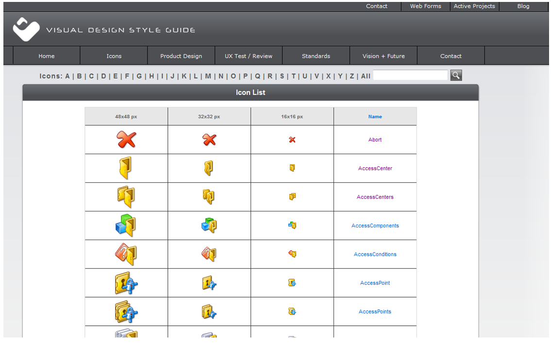
Combined with a Perforce depot (the VDSG — Vista Design Style Guide tooling), every icon had exactly one canonical home, one canonical name, and a deterministic path for every variant.
Artifact · circa 2006 · the actual VDSG browser interface
The team model
Principal designer as grammarian.
A dedicated Studio Team handled suite-level UI and image files. Each major product kept its own VD/UI lead for product-specific needs and to request new suite-level graphics from Studio. The principal designer controlled the grammar; product teams composed within it.
"We not only solved the Vista and Mac large-icon deficiencies — we created a reproducible process with single-designer optics, and a true iconic language using an atomic design system."
— Chris Anthony, on the win
Two registers · Branding & Verb-state
Product icons and Status icons.
Inside the iconic language, working icons split into two distinct registers — each with its own grammar, its own approval path, and its own place in the product surface. Confusing the two is the most common way a design system drifts.
Product icons
Branding — the proper nouns.
Identity marks for products and major features. They name a thing, not an action. In the 2010 Citrix system this was Receiver, XenDesktop, XenApp, XenServer, NetScaler, Access Gateway, Provisioning Server, Edgesight, Licensing, Workflow Studio, XenVault…
Where they live
- · About dialogs & splash screens
- · Add / Remove Programs
- · AutoPlay & browser favicons
- · Installers & licensing screens
- · Start menu & system tray
Status icons
Verb-states — what an icon is doing.
Conjugations of a working icon: running, paused, installing, checking for updates, error, locked, pending. Same base form, different verb. The status badge is the inflection.
Where they live
- · Tree nodes — title / error states
- · Toaster pops & notifications
- · Install progress & embedded image steps
- · Settings & connection center
- · Menus and live application lists
The rule
Product icons are nouns — they identify what. Status icons are verbs — they communicate what's happening. Both share the same atomic primitives and the same grammar; only the part of speech differs. A status badge applied to a product icon is the system's way of saying: "Receiver, installing" or "XenApp, error".
From Vista to Digital SanSkrit
The same idea, formalized.
The Vista project proved the thesis: iconography for complex systems is a language problem, not a style problem. Digital SanSkrit takes that proven practice — shapes, elements, base icons, applied icons, complex frames — and gives it the formal vocabulary of Sanskrit grammar: dhātu, samāsa, vākya, śāstra.
Shapes & Elements
Primitives (Dhātus) — the six atomic forms
Base icons
Rules (Sūtras) — composition grammar
Applied icons
Compounds (Samāsa) — six legal joins
Complex frames
Spatial grammar (Vākya)
Product icons (branding)
Domain ontology (Śāstra) — proper nouns of the system
Status icons (verb-states)
Conjugations (Vibhakti) — what a working icon is doing
VDSG depot
Guardian of the canon (Śāstra-Rakṣaka) — linter & enforcement
Studio team model
Teacher–student lineage (Guru-Śiṣya Paramparā) — training & succession
एक भाषा, अनन्त रूप · One language, infinite forms.